Core products
Apps
Create and organize
Edit and refine
Finish and distribute
Start from
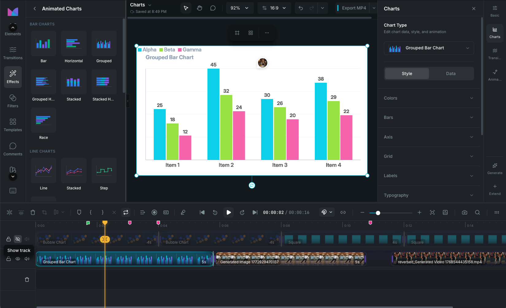
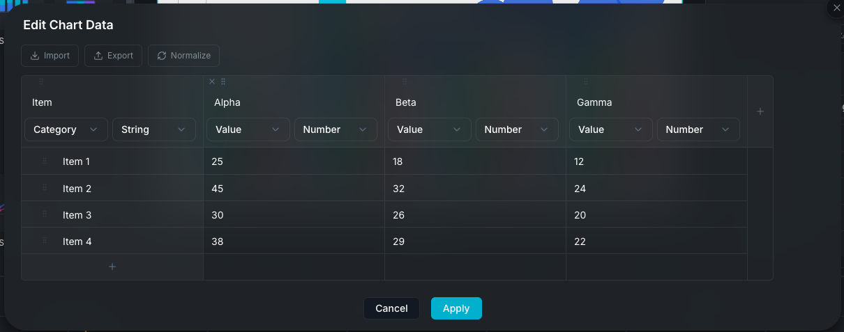
Prompt to video Move from prompt, script, and scenes into the editor.Document to video Turn PDFs and decks into guided project creation workflows.Recording to edit Capture screen or camera content and bring it straight into editing.Transcript-based editing Use text-first audio and dialogue workflows for faster cleanup.
Use cases
Explainers and demos Build clear product walkthroughs and visual explainers.Sales and marketing Create VSL-style edits, campaigns, and short-form assets.Education and training Record, subtitle, and deliver repeatable training content.Team collaboration Share projects, comment, and keep review loops inside the product.
Learn
Stay current
Program
Operations